The case for empathy maps in every user-centred project
Learn how to connect qualitative research to design outcomes with straightforward steps and real-world tips.
USER RESEARCH
Veilworx


Empathy maps are one of the simplest but most powerful tools in a user-centred designer's toolkit. They help teams, visually and collaboratively, see the world from a user's perspective without assumptions. Let's talk about what they really are, when to use them, how to build them, and why they're essential for any user-centred design process.
What is an empathy map?
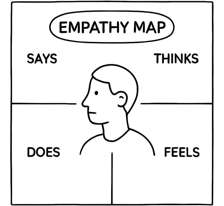
An empathy map is a collaborative visualisation tool that helps teams understand and align around what a user is experiencing. The empathy map was popularised initially by Dave Gray of XPLANE. It is essentially a quadrant with the user at its centre. A typical empathy map is divided into these four quadrants:
Think and feel - What's on the user's mind? What matters to them?
See - What's in their environment? What are they exposed to?
Say and do - What do they say and how do they behave?
Hear - What influences them (friends, media, environment)?


If you want to deepen the profile, you could include additional insights like pain points and opportunities. Empathy maps are similar to, yet distinct from, personas and journey maps. While personas describe user types and journey maps plot end-to-end interactions, empathy maps zoom in on the user's mindset during a specific situation or goal.
Why and when to use empathy maps
Empathy maps are handy during the early phases of a product development cycle. They document data, but most importantly, they shape the team’s mindset. Here are some of the best instances to use them:
During research synthesis: After conducting user interviews or fieldwork, use empathy maps to make sense of the information you've heard or gathered.
With cross-functional teams: Use it to bring engineers, marketers, or stakeholders into the room and keep them aligned in terms of understanding.
At project kickoffs or design sprints: This way, everyone on the project starts practising user-centred thinking from day one, which enhances user-centred design.
To turn qualitative data into design drivers: You can spot emotional cues or behavioural patterns that might not show up in analytics.
How to build an empathy map (Step-by-step)
Designing your empathy map does not have to be a "techy" procedure, but platforms like Miro, Mural, or Figma make the process team and remote-friendly. Here's a simple process to follow:
1. Collect qualitative data: This can be achieved by conducting interviews, usability tests, or ethnographic observations. These help you capture what users say and how they behave.
2. Define your user or segment: You have to focus on a single persona or user type at a time. If you don't keep it specific, you might gather conflicting data.
3. Plot your insights into the quadrants: Every hand needs to be on deck. As a team, populate each quadrant using sticky notes or digital cards. Stick to the facts from research.
4. Single out pain points and goals: Ask questions like “What frustrates the user?”, “What are they trying to achieve?” Use answers gathered to frame opportunities.
You can run these sessions in person with whiteboards or online using templates. The most important thing is collaboration.
Tips for effective empathy mapping
Keep these tips in mind when plotting your empathy map:
Capture the user’s exact words to keep the experience grounded.
Users won’t always say what they feel, but their actions speak volumes so observe actions, not just words.
Pull in people from different teams to contribute what they noticed and collect diverse perspectives.
Challenge assumptions by questioning if something is based on research, or being used to fill in blanks.
Stay specific. “The user feels confused when checking out an order” is more insightful than “the user feels bad.”
How to use empathy maps in design
Your empathy map shouldn't gather dust after a workshop. Apply it in the following ways:
Prioritise features: If users express anxiety about checkout security, prioritise improvements there.
Shape design principles: Use recurring themes (e.g., users feel overwhelmed) to guide tone, layout, or flows.
Communicate with stakeholders: Empathy maps are powerful storytelling tools. They humanise the data and get buy-in for user-first decisions.
Anchor ideation sessions: Before brainstorming features or flows, revisit the empathy map to stay aligned with user context.
In essence, empathy maps help product teams build with the user in mind, not just for them.
Start mapping empathy into your design process
Empathy maps create space for the emotional reality of users, which is often overlooked in fast-moving product cycles. If utilised correctly, they help teams listen to users, align easily, and design with clarity.
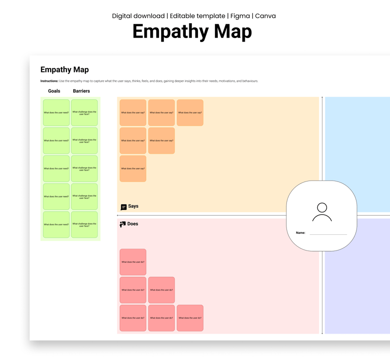
This week, try running a 30-minute empathy mapping session with your team using our fully-editable Empathy Map. Start with just one user story.


Design resources that deliver results
Copyright © Veilworx Ltd 2024. All rights reserved.
Registered in England and Wales.
Company number: 15318142
Contact
Email: contact@veilworx.com
Address:
Office 9944, 182-184 High Street North East Ham London
E6 2JA
Business hours:
Monday to Saturday: 10am to 6pm
Sun: Closed
