Creating user flows for multi-step signups that don't frustrate users
Walk through the essentials of building signup flows that flow, covering step design, user behaviour, microcopy, and friction testing.
INTERACTION DESIGN
Veilworx


Multi-step signups can be conversion gold mines, but only when done right. The number of steps is just a factor of the process; the secret lies in understanding how your users think, behave, and make decisions, especially under pressure. This post will show you how to map out user flows that guide users through the process with ease and zero friction.
Why multi-step signups exist and when to use them
Multi-step signups are essential during account creation, onboarding processes, identity verification, and setup flows. In these instances, you’re collecting significant information from your user. However, when you ask your users to create accounts, verify information, set preferences, and configure settings, all in one massive form, they will get overwhelmed. Using a multi-step signup prevents that. Do note that not every signup needs multiple steps. If all you need is a name and email, use a one-step signup. Don’t complicate things.
What makes a good multi-step flow
A good multi-step flow should possess these key elements:
Clarity of progress: Use progress bars or step indicators so users always know where they are. This will keep them committed to what they have started.
Logical sequencing: Start with the easiest questions first and build momentum as you go.
Contextual support: Helpful hints, tooltips, and inline validation will help reduce confusion.
Minimal required inputs: Only ask for what’s absolutely necessary at each step.
The goal here is momentum. Each completed step should help users immediately understand what's coming and why each step matters.
How to map effective user flows for multi-step signups
Before touching any design tools, map out your complete user journey. You’re not trying to create perfect wireframes here; you want to understand every decision point where users might abandon your process.
Start with real user goals: Your users are trying to find solutions to actual problems. Understanding their genuine motivation helps you design purposeful rather than bureaucratic flows. Ask yourself - What does success look like for your user after completing signup? What's the absolute minimum information needed to deliver that first win? Everything else can wait.
Plan for human behaviour: Real users don't follow perfect paths. They make typos, change their minds, lose internet connections, and get distracted by notifications. Your user flows need to be built to handle these messy realities.
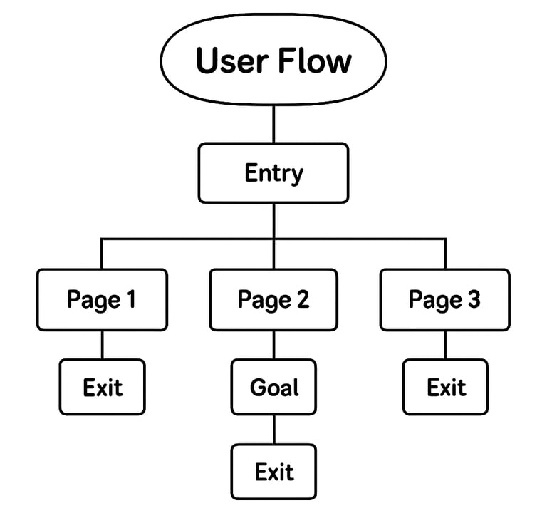
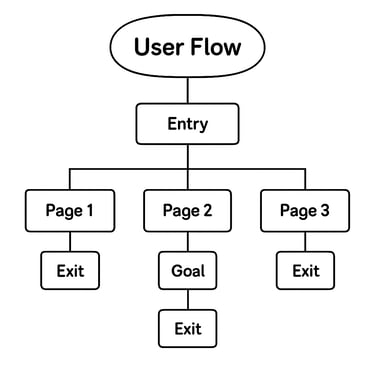
Sketch it out: Map each screen and action like a flowchart. Visual mapping helps you spot issues that aren't obvious in written requirements. Include all possible paths users might take, not just the happy path.
Remember to add alternative flows: skip, edit, or abandon. Plan from the start to avoid headaches later.
Mandating collaboration between content designers and UX teams
The interface design is only half the battle. The words you use at each step can make or break the user experience. Forms create inherent anxiety, especially when requesting personal information. Strategic content writing for forms helps users feel confident throughout the process. Some best multi-step signup content practices are as follows:
Set clear expectations (for instance: This takes 2 minutes), explain your reasoning (e.g We need this to personalise your experience), and maintain an encouraging tone.
Error messages deserve special attention. Instead of generic "Invalid input" warnings, provide specific solutions: "Try using fewer than 20 characters" or "Please include an @ symbol in your email address."
Your brand voice should remain consistent across all steps, even when dealing with technical requirements or error situations.
Your clear call-to-actions should reinforce progress at every step. Replace boring "Next" buttons with action-oriented copy like "Create My Account" or "Continue to Setup."
Test and iterate your user flows
Testing reveals gaps between your assumptions and user reality. A few tips to apply are:
1. Focus on metrics that matter, like completion rates, drop-off points, user confidence, and error frequency.
2. Run lightweight sessions with 5-7 users, watch where they hesitate or struggle; those moments reveal optimisation opportunities.
3. Tools like Mixpanel or GA4 can help you map out your signup funnel. That way, you can track where users drop off. Is it after email entry or password creation? Find out.
4. Collaborate with your devs to handle edge cases like slow networks or expired links. These issues can break the flow but are easy to miss.
Design smarter multi-step signups
The best multi-step signups feel less like administrative tasks and more like guided conversations. Your signup process is often your users' first real interaction with your product, make it count. Design flows that respect users' time, provide clear direction, and handle inevitable problems with grace, rather than serving your internal requirements.
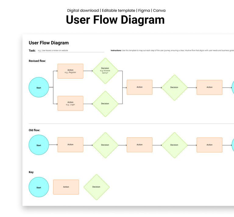
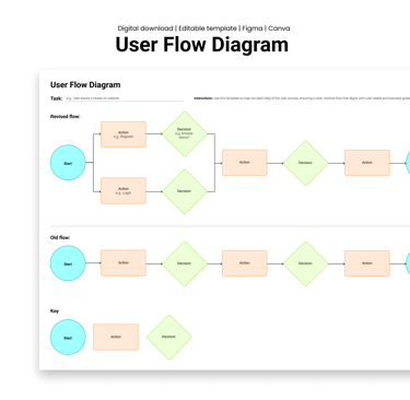
Download Veilworx's User Flow Template and start designing smarter signups today.
Design resources that deliver results
Copyright © Veilworx Ltd 2024. All rights reserved.
Registered in England and Wales.
Company number: 15318142
Contact
Email: contact@veilworx.com
Address:
Office 9944, 182-184 High Street North East Ham London
E6 2JA
Business hours:
Monday to Saturday: 10am to 6pm
Sun: Closed